
An analysis of how information design supports the Museum’s mission of preservation, education, and hometown culture
During a recent visit to the Millard Fillmore House Museum in East Aurora, New York I asked the docent what the East Aurora’s Historical Society wanted to achieve through the information design in the signage and exhibits of Millard Fillmore’s first Western New York home? Her response was simple, they want to preserve local history, provide an environment for lifelong learning – visitors range in age from pre-school children to senior adults, and contribute to the vitality of the East Aurora community. So, let’s explore how they use information design to accomplish their intent.
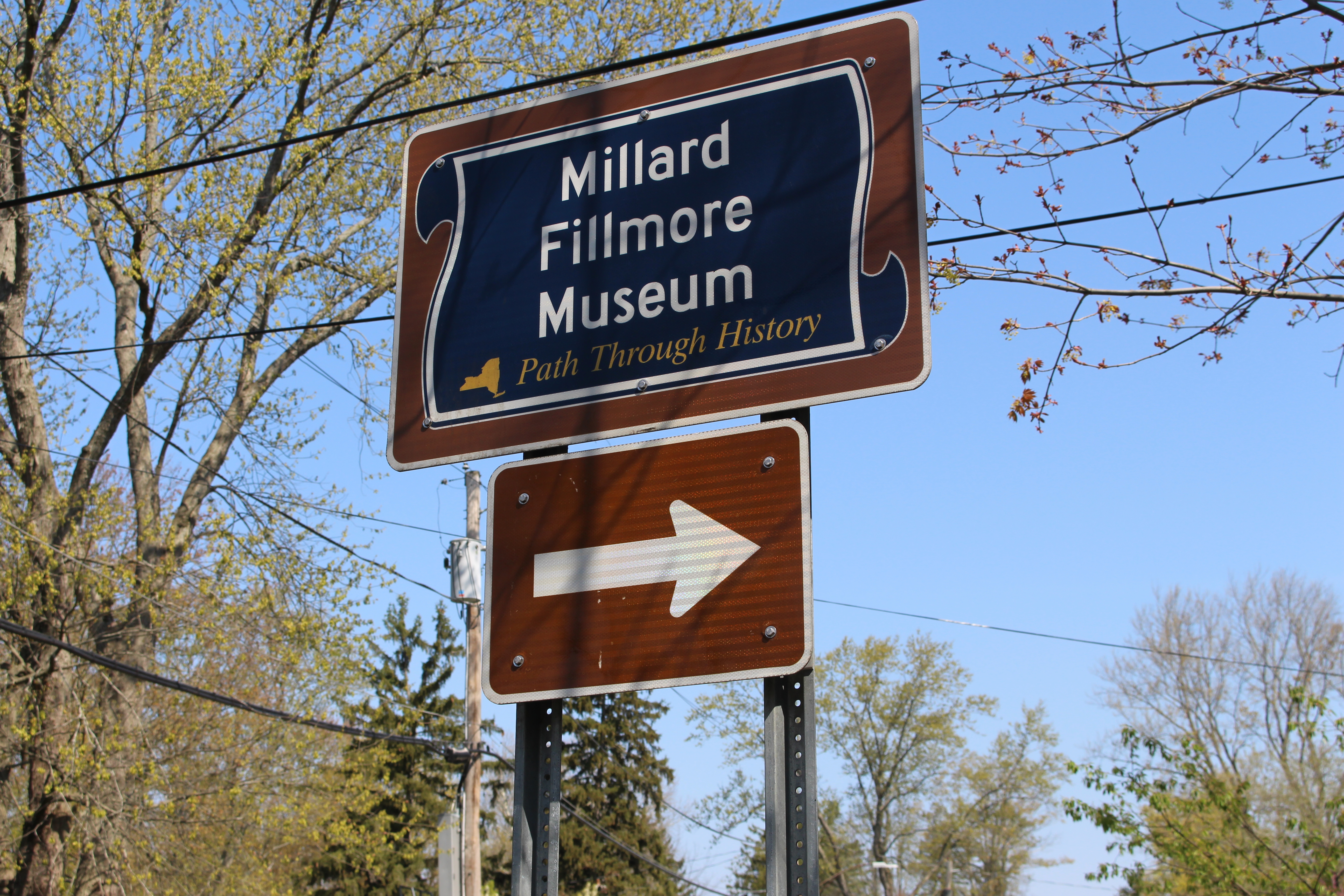
First, the signage from Main Street uses size in both canvas and text. The first indication of the Museum is marked with arrows, followed by another sign with operating information. The graphic design employs color contrast and large font size so the signs can be clearly visible from all modes of transportation. The placement and prominence of the signs incorporate the Museum into the community while providing helpful wayfinding to the intended audience – the public. The signs also become purposeful by advertising the Museum is part of the social and economic culture!
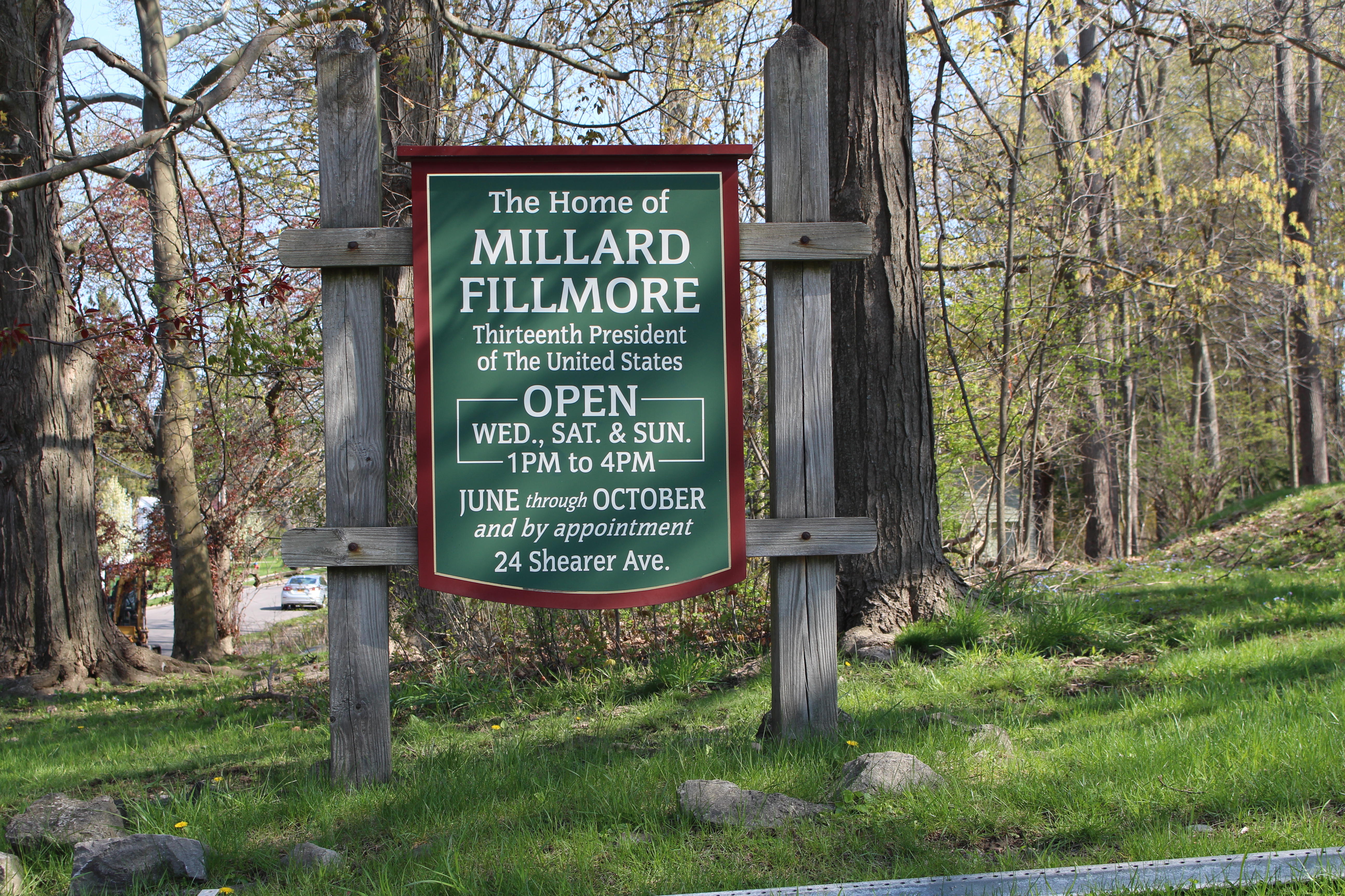
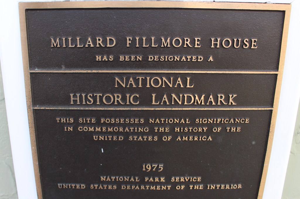
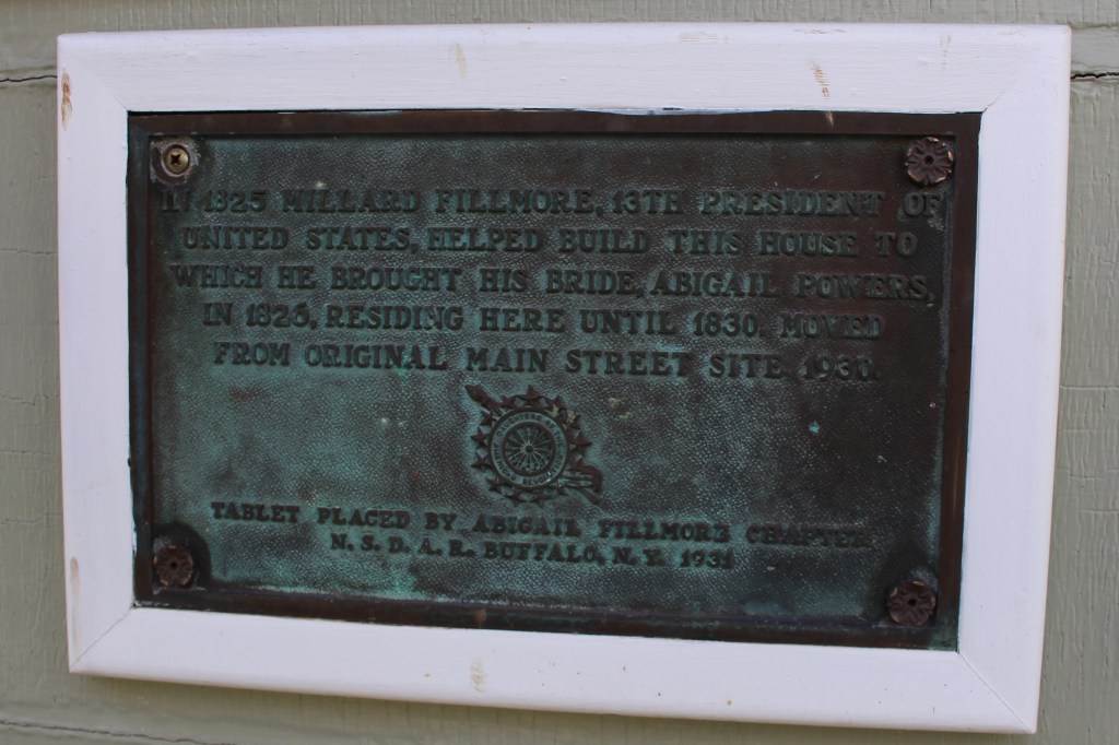
To illustrate history, the Museum uses a combination of signs and plaques. The entrance sign displays black and white lettering in a font that infers an older style of writing. The plaques are cast with raised lettering, dark colored backgrounds, and gold or bronzed lettering making them recognizable as historical landmark markers.

Millard Fillmore House Museum 
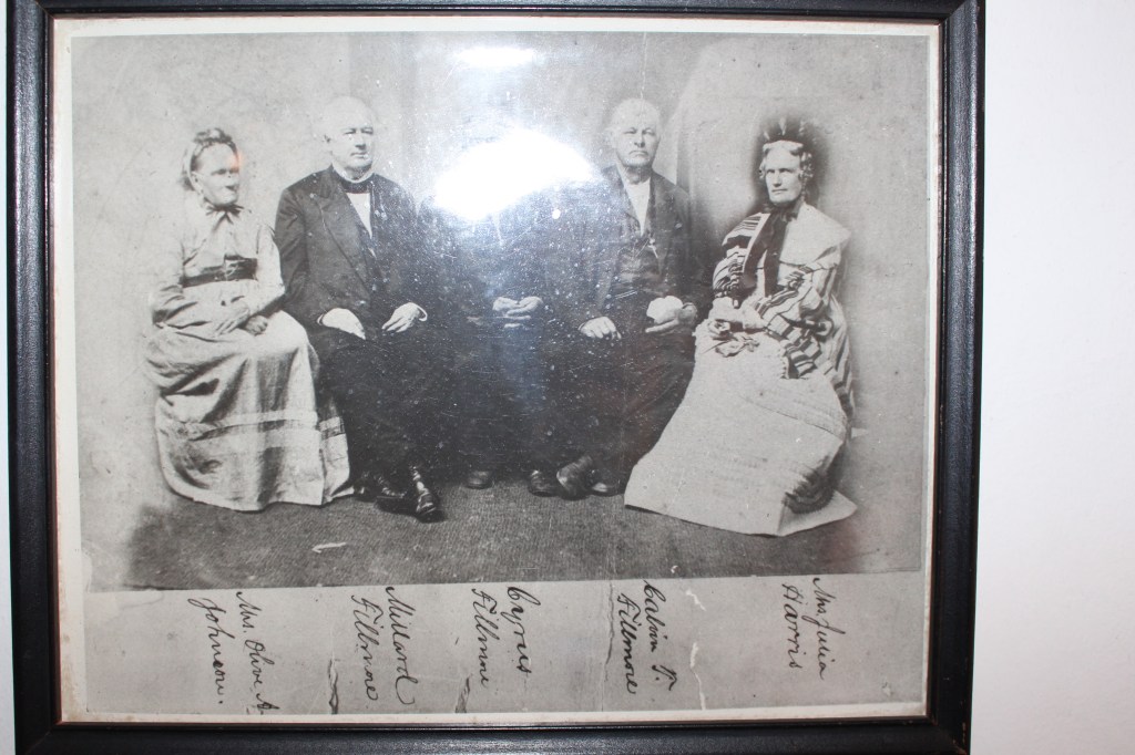
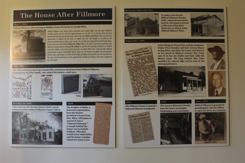
The interior has a variety of methods information is illustrated or defined – using imagery, notice on the old picture and book only have hand-written labels, this could be considered a use of plain language, that is, names identify who is in the picture and who owns the book, this mirrors how labeling was used during the late 1800’s. At the same time, to document pivotal events of the residence the curators use a modern collage format to highlight pictures and newspaper articles – the contrast and a font size functions in balance with the pictures – an effective use case of graphic elements, scale, grid application, and grouping.

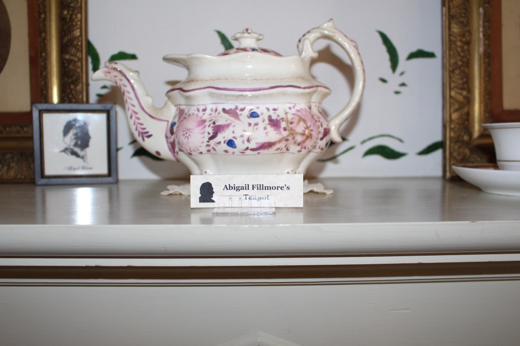
Small tabs are designed for personal, material pieces throughout the house. The purpose of using a small canvas and font is to identify the use and owner but let the history piece remain as the focal point.
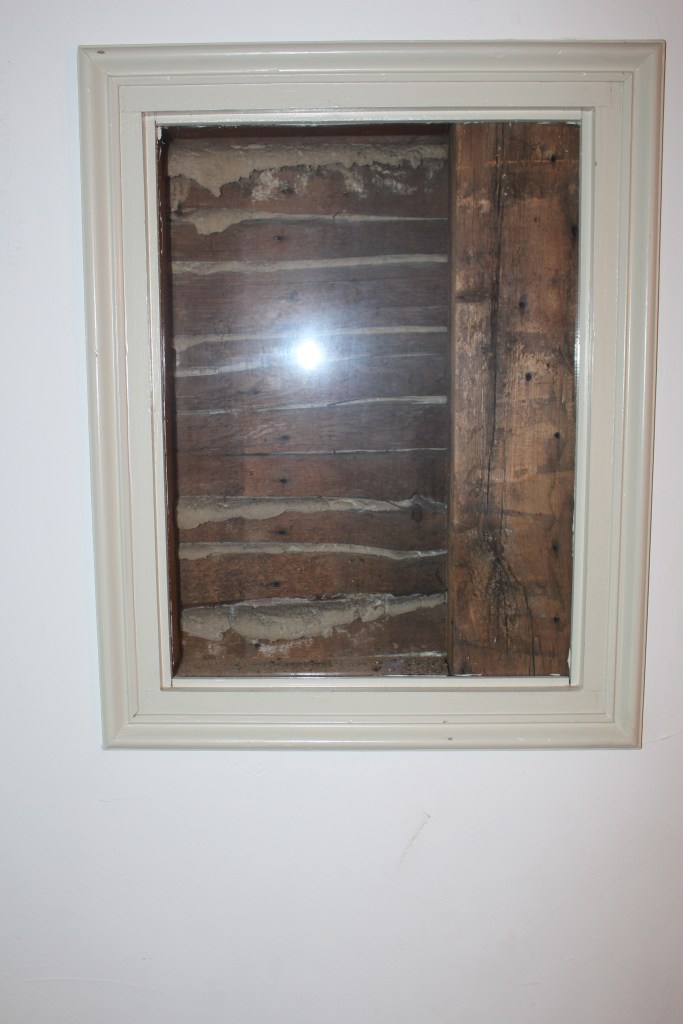
Last, and the one I found the most interesting, has no label or description, just a frame.
References
Baer, Kim, “Information Design Workbook“, Rockport Publishers, Beverly, Massachusetts, 2009
Photography by Priscilla Repka
