Infographics – what does it tell us

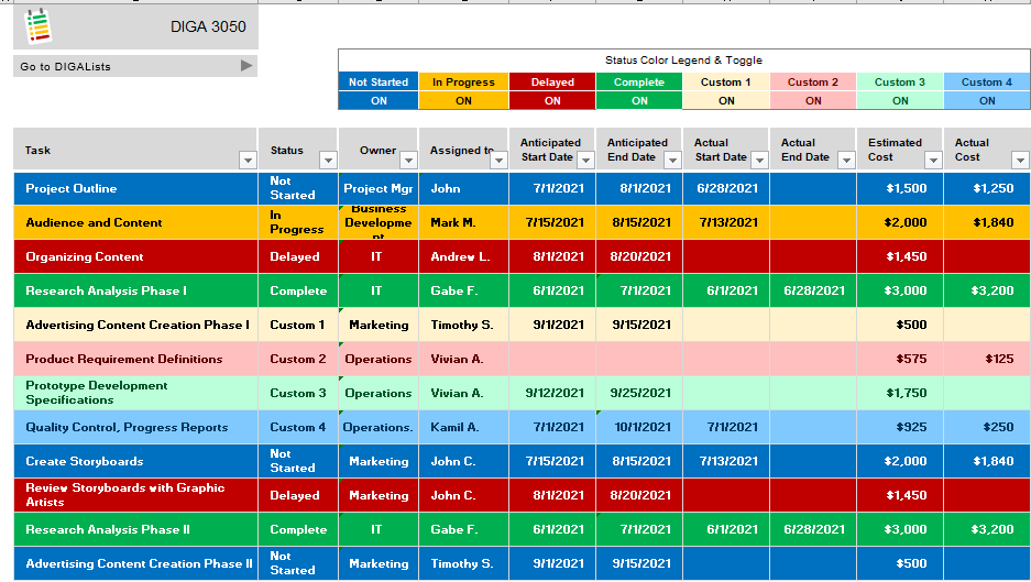
In the world of 2021, everyone – in some way or another – is exposed to social media. People use it to keep in contact with family and friends, find recipes, explore travel options, or meet with like minded people with the same interests. The list could go on and on, and yet in this vast environment the intent of social media is basic. We use infographics, to show social media’s intent of engagement. “It (infographic) keeps people’s interest by lending a storytelling and visual element to what can be sterile research.” (McCabe)

This is effective because it provides the use case and purpose of social media. This infographic illustrates the reach of social media across demographics, market sectors, geographical and cultural environments. The most important component of this visual is strategy. There is a deliberate approach to reach an audience that can be applied in various design principles, but still has the intent to involve a targeted audience.

“6 Elements Social Media Strategy Infographic” by Maria Peagler is licensed under CC BY-ND 2.0”

References

Created by Susan Wilson, this work builds on the efforts of Jennie Goforth and Suchi Mohanty at U. of N.C., https://guides.lib.unc.edu/infographics and is licensed under a Creative Commons Attribution-NonCommercial 4.0 International License.


Information design process – Let’s start at the beginning!

Let’s talk ‘information design process’.  Process, defined by Oxford Languages simply means “a series of actions or steps taken in order to achieve a particular end.”

The best and most practical way I can think of to explain a process within Information Design is to start with the Outline of the Process. This is one of the most important steps of information development because it provides a pragmatic approach and foundation of –  ‘what’ the project consists of,  ‘who’ is involved, ‘how’ are roles and responsibilities assigned based on expertise, ‘what’ is the timeline by task and project, and finally, a systematic way of keeping everyone moving forward and aligned.

Just as important of what goes into your information design is what should not be included in your project. According to a study from the Communication Research Institute in Australia resources use 50% of the project time involved in politics, that is, “Politics is about people’s interests. People argue and define what is of interest to them materially and organizationally.”  (Baer p.35) This objective approach provides the checks and balances to keep the information accurate, purposeful and  timely.

This process could be improved by including metrics that validate the content is useful, example: if the intent is to increase market share then how will growth be measured or weighted against this project?

Here is an example of a design information outline: (author: Priscilla Repka using MS Excel project templates, March 2021).

Design can be art. Design can be aesthetics. Design is so simple, that’s why it is so complicated.”

Paul Rand,  American art director and graphic designer

References

Baer, Kim, “Process: Discovery”, Information Design Workbook, Rockport Publishers, Beverly Massachusetts,

Oxford Languages, https://www.google.com/search?q=process+definition&oq=process+de&aqs=chrome.0.0i433j69i57j0i131i433l2j0l3j69i61.3314j1j7&sourceid=chrome&ie=UTF-8

Rand, Paul, Paul Rand Quotes (Author of Thoughts on Design) (goodreads.com)


Graph Theory – what is the connection?

All you have to do is connect the dots. Such a common phrase used for thinking, games, even for directions but let’s take it to another level and relate it to information design, specifically graph theory. “Network science originated in graph theory, and the mathematical foundations set by Leonhard Euler in the eighteenth century” (Meirelles p.48).  Euler questioned if someone could walk across 7 bridges in Konigsberg, which was a capital in Prussia during this time, crossing each bridge once. His use of a graph to solve this problem showed it could not be done, but a new information design theory was created. Building these networks or graphs establishes relationships by “…capturing only the basics of connection patterns and little else:” (Meirelles p.48).

I believe sometimes less in more and visual connections can provide the viewer with the magnitude of a situation or the answer to a puzzle. It can look dynamic and explain a lot. A benefit to the viewer who is using this information.

On the flipside, it could look confusing if you do not have a direct understanding or explanation of what message is being conveyed.

“Footballers Search Relations Network Graph” by yaph is licensed under CC BY-NC-SA 2.0

There are pros and cons to this theory – which would lead to reason it needs to be used suitably. Put another way, it must connect not confuse.

References

Meierelles, Isabel, “Relational Structure Networks”, Design for Information, Rockport Publishers, 2013

Creative Commons https://search.creativecommons.org/


“What is Information Design?”

When you first think about ‘Information Design’ you might imagine graphics, data, or written copy used in a professional environment, maybe a business brochure or a retail web site but, we receive and process information continually and differently – so in truth, “What is Information Design”? The Society for Technical Communication frames the concept logically “…the translating [of] complex, unorganized, or unstructured data into valuable, meaningful information”. (Baer p.12)

In practical application, this definition of Information Design unlocks the question for all of us. All you must do is look around to see examples of this discipline in everyday life, such as restaurant menus, map directions, kiosks, and blogs! Of course, it still includes business text – real estate brochures, company presentations, or research documentation.

But what also makes organized, complex, and structured data valuable? Insight! According to Nathan Shedroff, “Insight is what is created as we add context and give care to both the presentation and organization of data, as well as the particular needs of our audience” (Baer p.36). Let’s examine the way the Center for Disease Control uses clear language and associated visuals to educate the public on the Covid-19 vaccine safety. As people start to receive the vaccine they want to be reassured of oversight, to do this the agency condenses their message of multi-agency collaboration and technology processes in hope of gaining public trust – as a result the intent and delivery of this information design becomes purposeful.

“The human brain is wired to instantly process a picture and to never forget a story.” – Dan Roam

References

Baer, Kim, “InformationDesignWorkbook”, Rockport Publishers, Inc, Beverly MA, 2008

Center for Disease Control 2020 “Continuing the Journey of a Covid-19 Vaccine”, Retrieved February 3, 2021 from https://www.cdc.gov/vaccines/covid-19/downloads/journey-of-covid-19-vaccine-508.pdf

Roam, Dan, “Visual Roadmaps and Stories”, Digital Room Inc, San Francisco CA, Course content from DIGA 3050 SUNY ESC, Retrieved February 3, 2021 from https://www.danroam.com/showcase